Making the Edgar Allan Poe Macabre Mansion
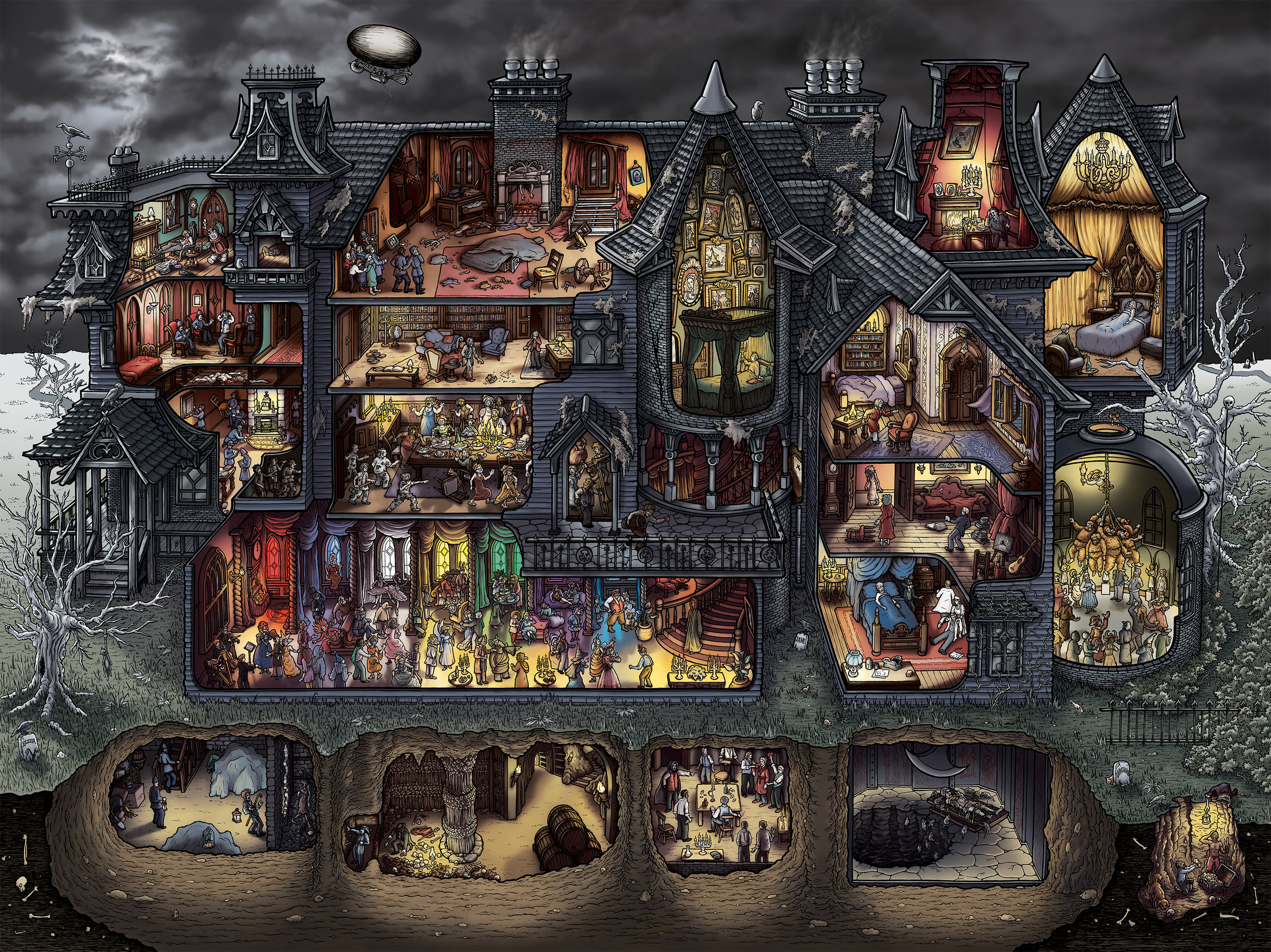
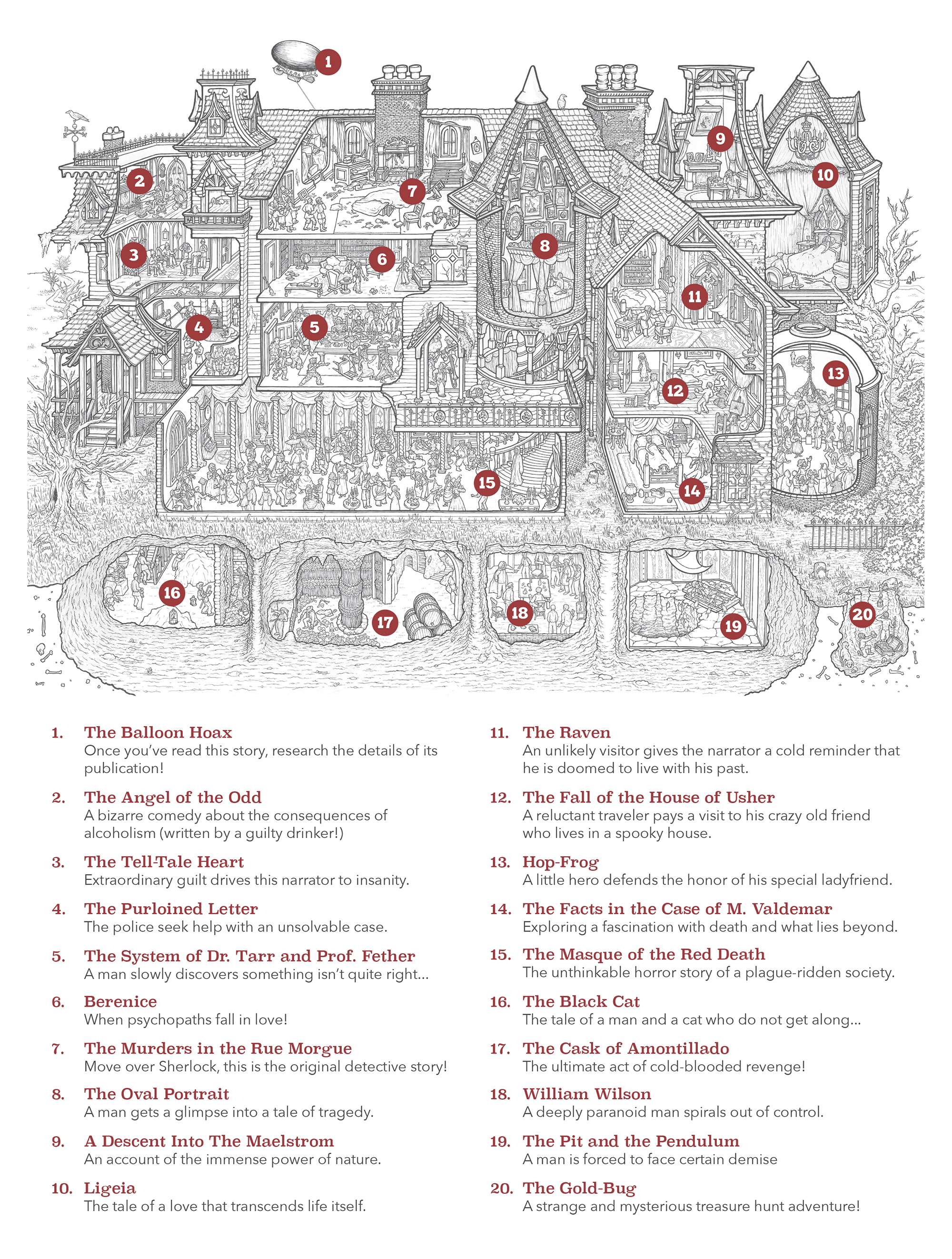
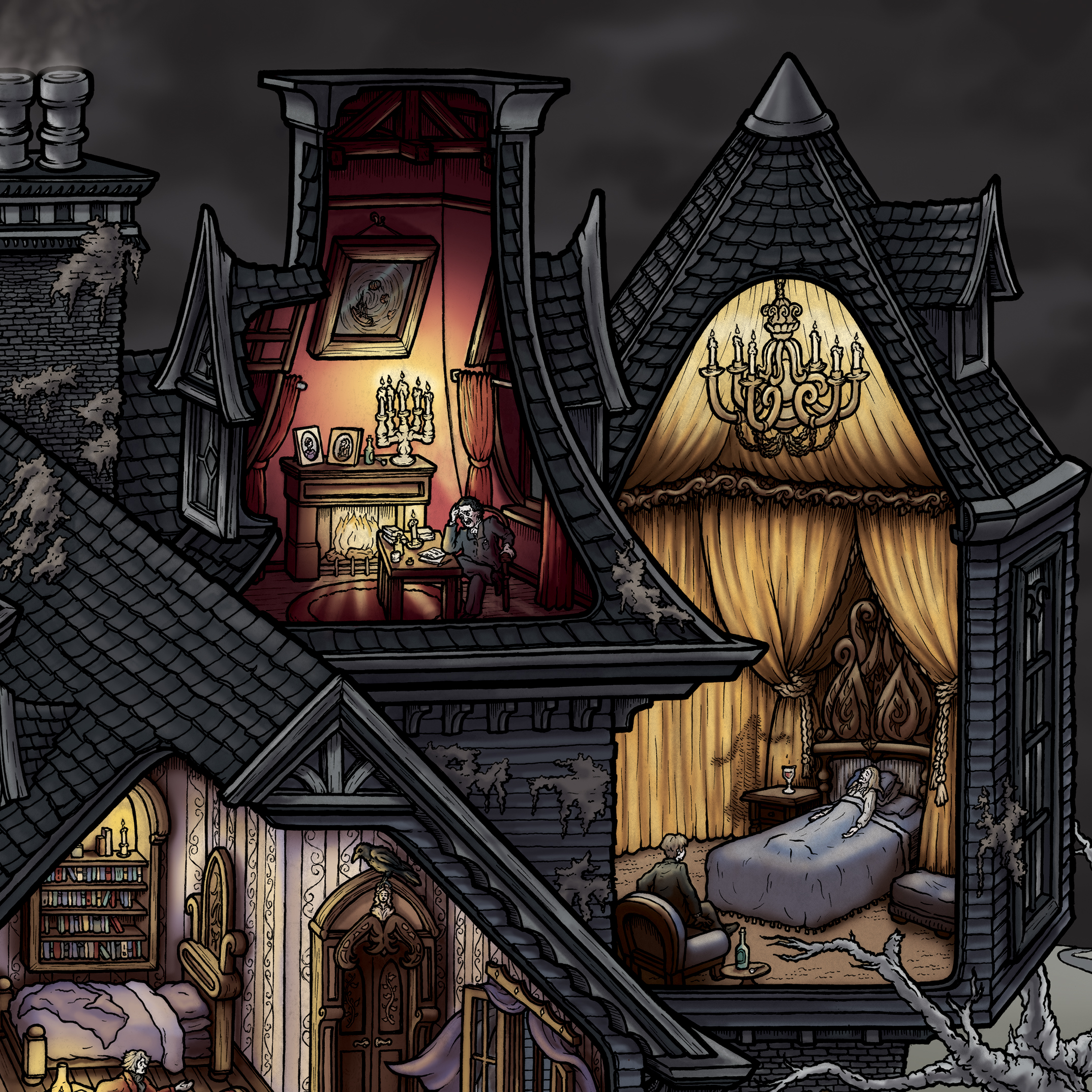
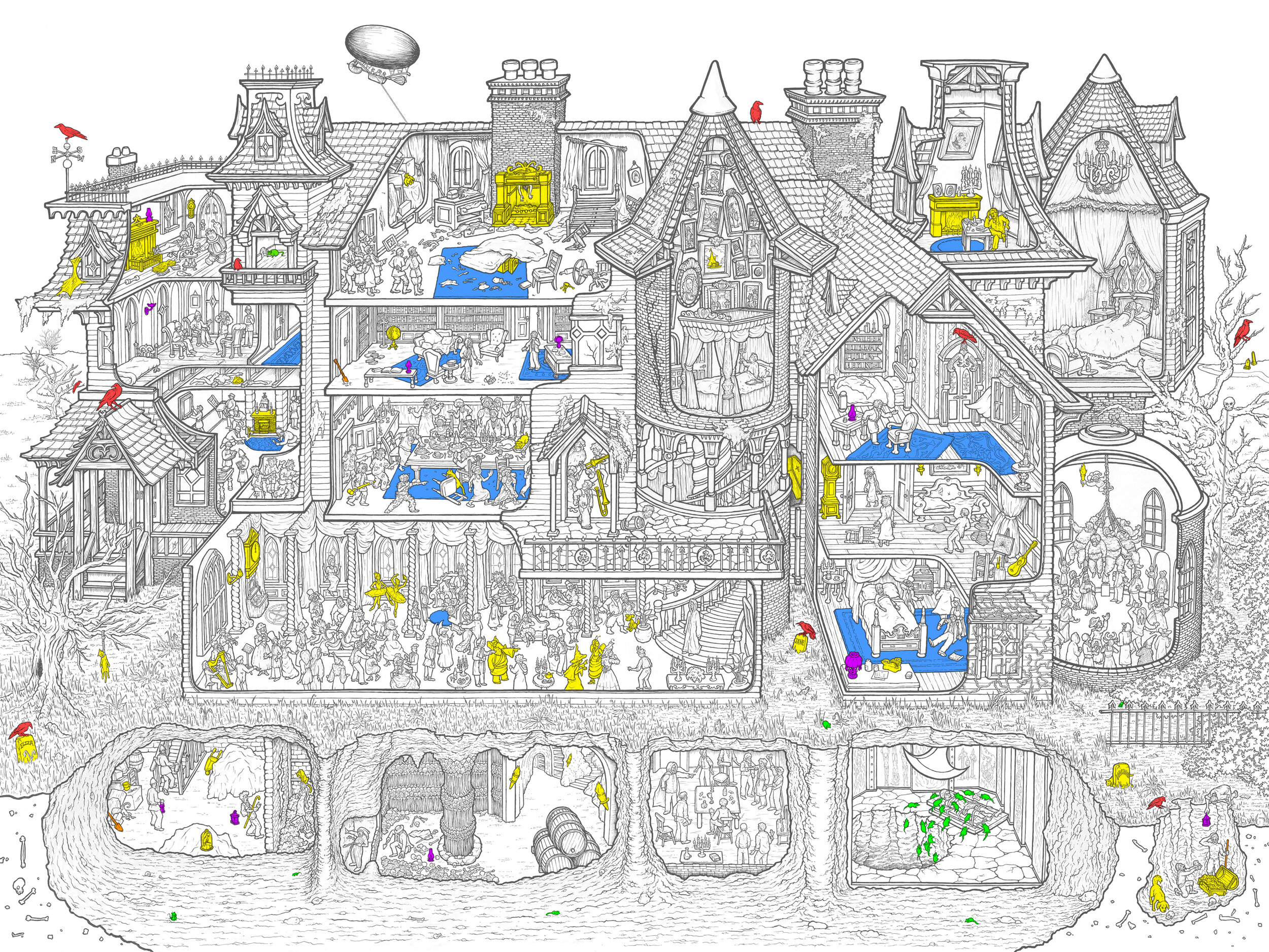
/Last year I made the H. H. Holmes Murder Castle cartoon cutaway and Kickstarted the production of jigsaw puzzles featuring the illustration. It was really well received and I loved the challenge of the project, so I decided to make another one. I learned a lot making Murder Castle and applied those lessons to The Edgar Allan Poe Macabre Mansion, which illustrates 20 of the author's short stories in one big, creepy house. (At the bottom of the entry you can find detail shots and a key identifying all of the stories. There is also a key showing the answers to the seek-&-find game included with the puzzle.)
Note: Jigsaw puzzles and prints of both the H.H. Holmes and Edgar Allan Poe illustrations are now available in the store!
PUZZLES & PRINTS NOW AVAILABLE!
I hadn't read a ton of Poe's work when I decided to use him as the subject, mostly just the stuff you read in high school (The Cask of Amontillado, The Tell-Tale Heart, The Raven...) The whole buried-in-the-walls thing seemed like it would translate really well to a cutaway and I figured the project would be a great excuse to read all of his short stories. Also, public domain ftw!
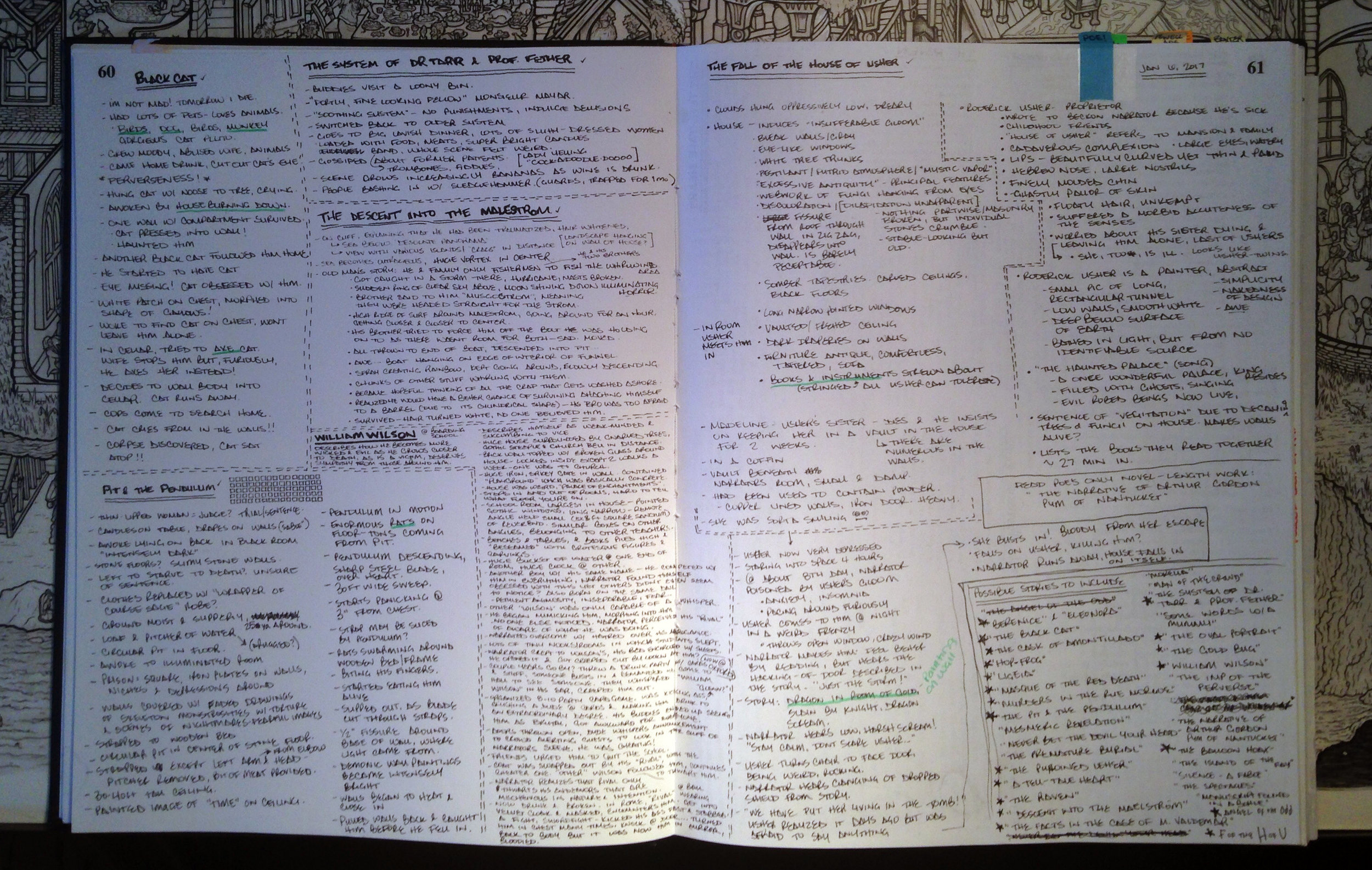
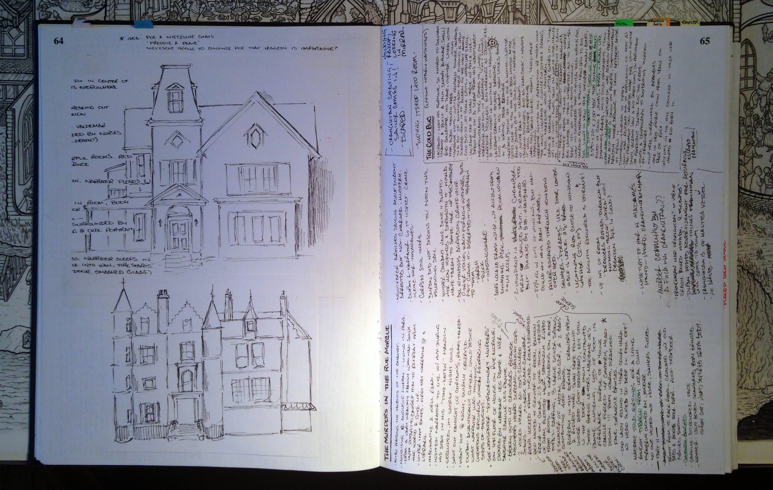
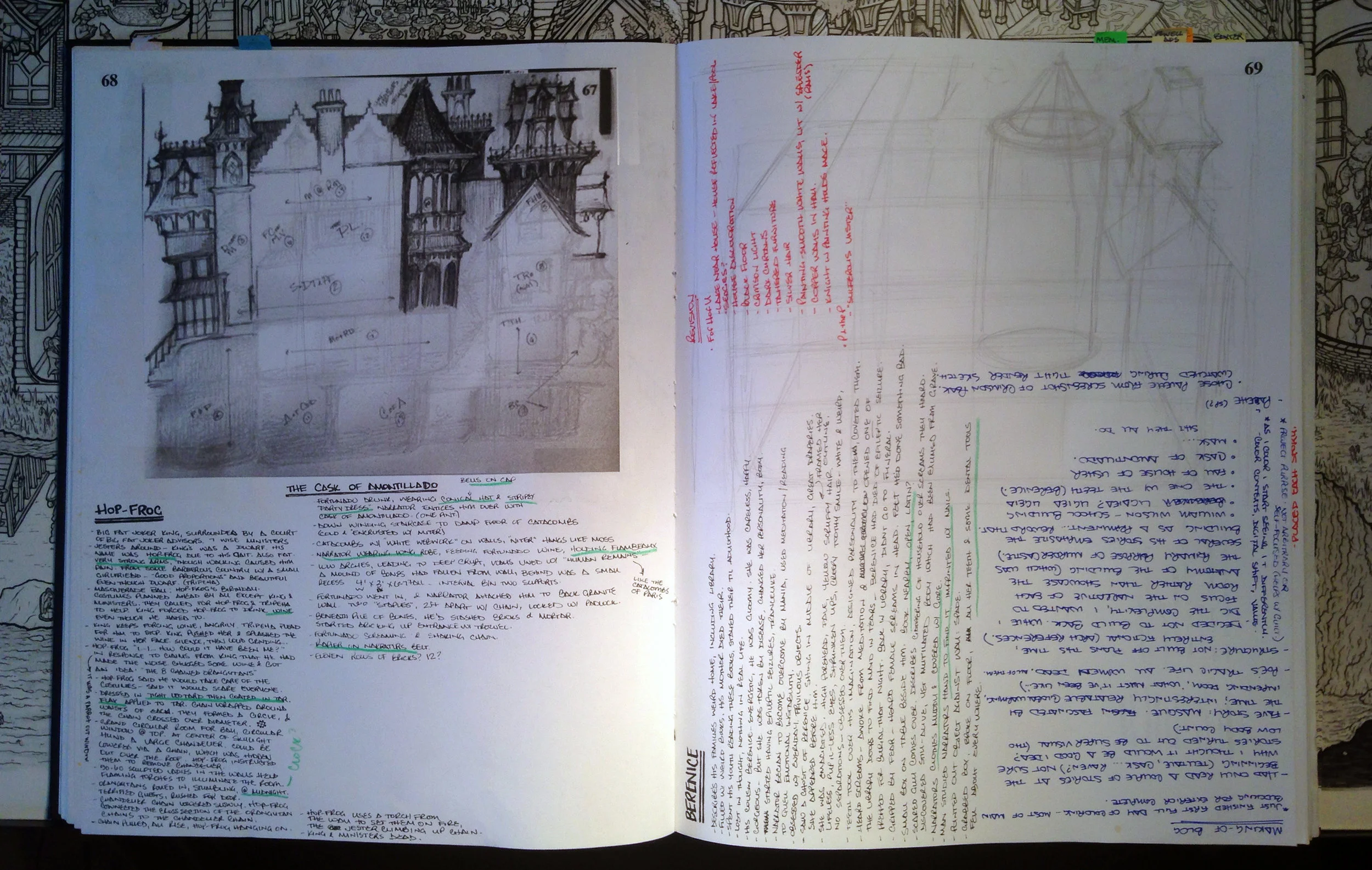
The first step was to ingest as much of his work as possible and decide what to include. I listened to audio recordings of the stories, taking thorough notes along the way. There are tons of these recordings on YouTube, my favorites being those read by Sir Christopher Lee. (There's also a reading of The Raven by Christopher Walken!)
I didn't know how many of the stories would be appropriate for the drawing, but every single one was so visual and compelling I ended up with too many! His work is incredibly immersive; it was wonderful spending so much time studying it. In my notes I included as much visual information as possible, then used it to guide me in the design of the house.
Poe begins The Fall of the House of Usher with a long, moody description of the building, so it only made sense to use the Usher house as a base for the mansion. I studied elements of gothic architecture - lots of turrets and domes and porches and overhangs - and incorporated my favorites into the sketch. I thought inventing a fictional building would be easier than drawing a real one from blueprints like Murder Castle, but it was actually more challenging to make one up. However, one great thing about this style of architecture is that it allows for a completely weird structure (most houses from this period are kind of a hodge-podge) so I could put welrdly-shaped rooms wherever I wanted!
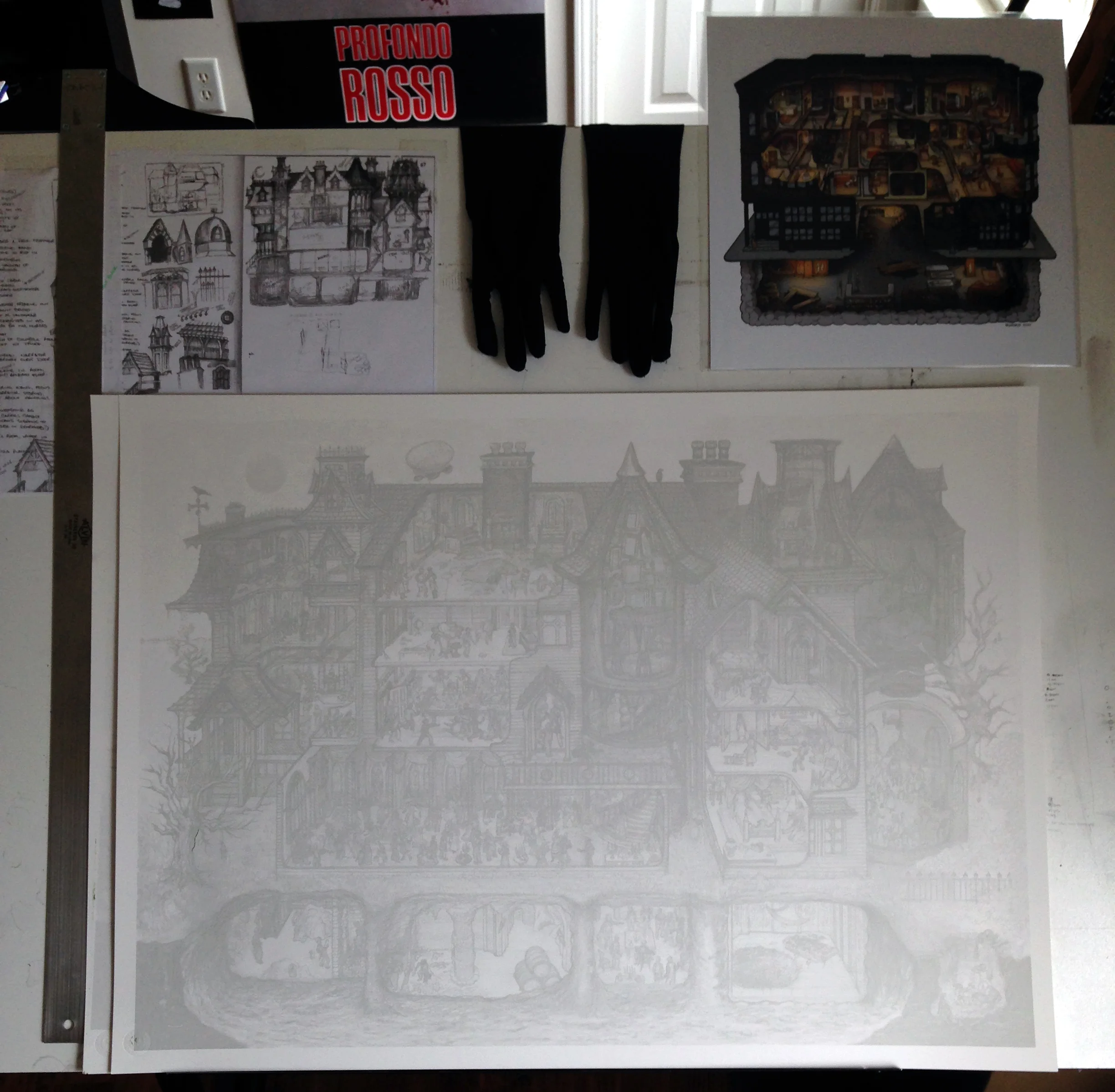
I found this old piece of watercolor paper that I'd used to create a gradient for the background of Murder Castle. With the jigsaw puzzle dimensions in mind, I applied a grid and got stuck in, keeping Murder Castle close by during the whole process in an effort to maintain a similar style.
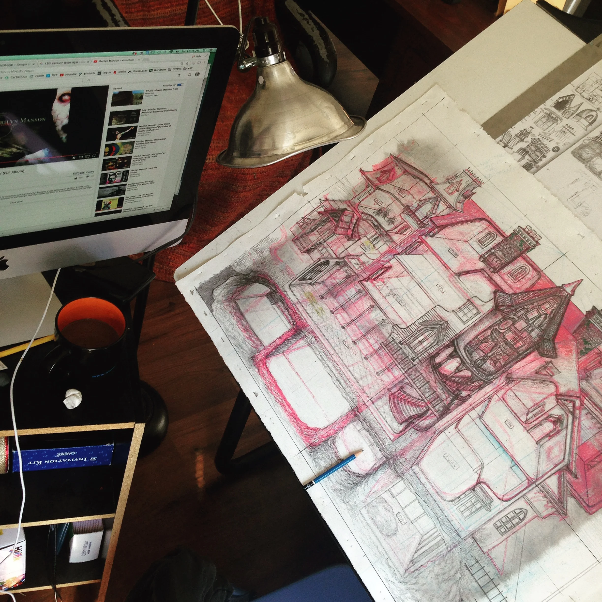
My super rough sketch (the blue and orange sketch above) was 2D, so I had to convert it to three dimensions. I use a basic two-point perspective, but there's a lot of eyeballing and fudging. When I did Murder Castle, I scooped out the building so you could see rooms behind those at the front of the house. As this design was so much more complex, I decided to shorten the depth to a single room. I began the sketch with blue pencil, making lots of mistakes and changes, then used a darker pink pencil to refine it.
The drawing went through a LOT of changes during this stage. Once I had the rough structure down, I used a graphite pencil to draw a detailed sketch on top.
The center of the image, where the cylindrical tower and the large rectangular section meet, caused me a lot of trouble. I couldn't figure out how to draw it in a way that the layout was clear. After several attempts, I ended up with this a big, ugly roof chunk at the center and it was bumming me out. I ended up solving the problem by turning it into a balcony. :)
During the sketching process, I referred to images I'd collected of gothic revival houses. My sister, Bethan, helped me collect reference pictures for the interiors, furniture, and costumes, which were super helpful. I continued to make a bunch of changes as I went; lots of drawing and erasing and redrawing.
Here is the finished sketch. As you can see, I made a bit of a mess!
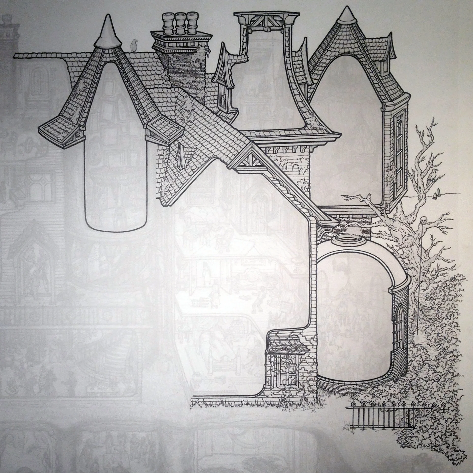
The next step was to scan the sketch and print it at a low opacity on some nice clean Bristol so I can start the best part: INKING. I draw with Micron .005 pens and DO NOT use a ruler during the inking process. It makes the lines look too precise and boxy and if I wanted that I'd just draw it in Illustrator. The lines may look straight, but if you look really closely you can tell it's all shaky and neurotic, just like me!
For whatever reason, I started in the upper right corner and began drawing the exterior. One regret I had with Murder Castle was not including enough surface details and textures, so this time I turned it up to 11, so to speak.
The exterior took a long time, and since there were loads of bricks and panels and tiles, much of the drawing was fairly mindless. I listen to tons of podcasts while I'm working. During the inking phase I spent most of the time with The Partially Examined Life, The History of Philosophy Without Any Gaps, and The Complete Guide to Everything (pretty much my favorite podcast of all time). Highly recommend all three!
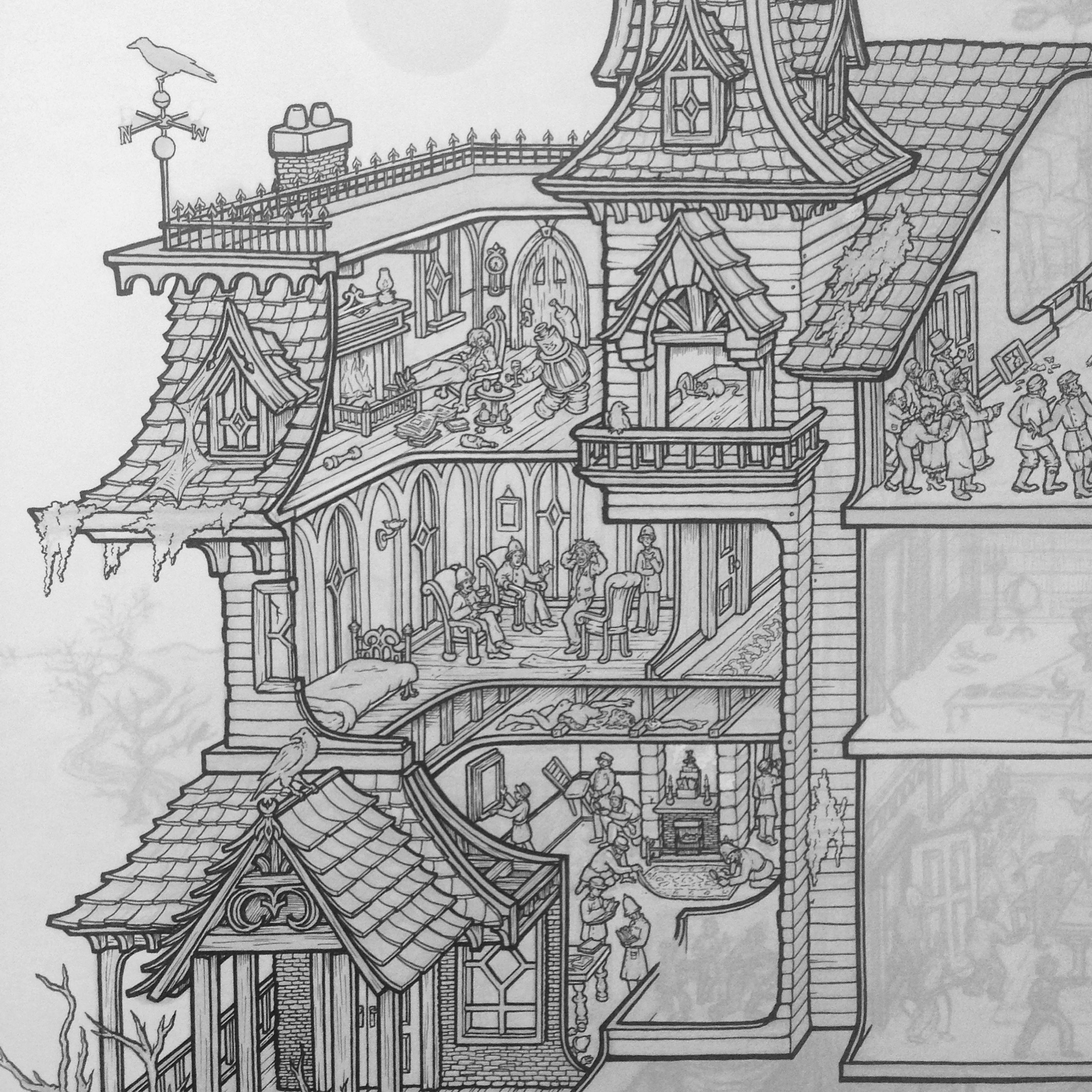
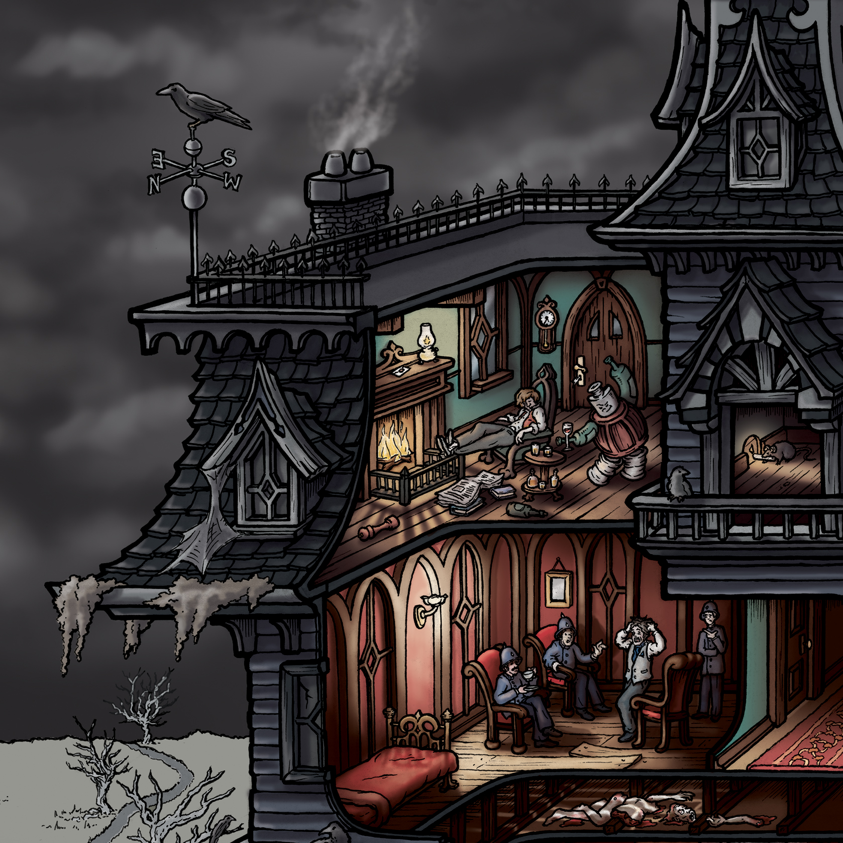
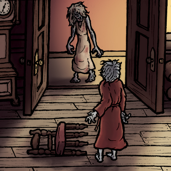
When the time came to begin the interior, I was so excited! Finally getting to the juicy bits. The first room I drew, and probably the most peculiar of Poe's stories, was The Angel of the Odd. Seriously, it is incredibly weird and there's no way he wasn't plastered when he wrote it. Thumbs up!
The Angel of the Odd
Side note: Around this time, I went to Minneapolis to visit Bethan. We went to an amazing Guillermo Del Torro exhibit and look who I found! Turns out he's a big Poe fan. He also had original Crumb and Wrightson drawings in his collection - I was in heaven! (This is not the only time Guillermo comes up in this project!)
As the inking continued, I had to keep referring to my notes to make sure I was including the right details. My aim was to have as little fluff as possible. Every item should be intentional and allude to something within a story. There are two unfortunate inconsistencies in the drawing which you'd only notice if you listened to the story carefully, but I'll leave them to you to find!
Hop-Frog
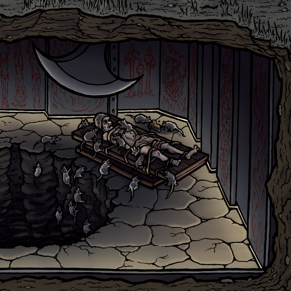
The Pit and the Pendulum
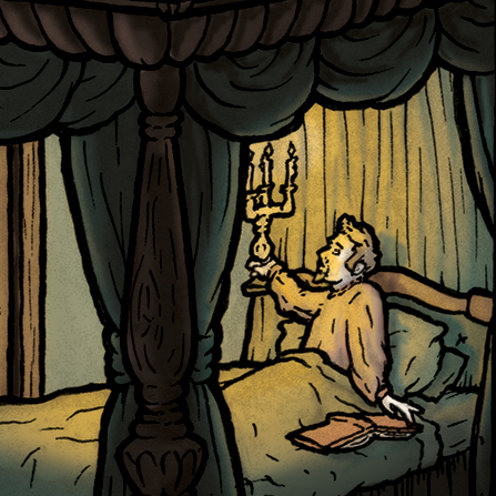
The Masque of the Red Death
After many, many hours (I honestly have no clue how many), the drawing was finished!
At this point, it was time to convert the Macabre Mansion to 1s and 0s! I scanned the drawing and mentally prepared myself to enter yet another seemingly endless phase of the process: COLOR
I'll be adapting this into a coloring poster! It'll take you ages to finish! >:)
Here's the other Guillermo bit: As I was working on this project, I happened to see his 2015 movie Crimson Peak for the first time. Not only did I really enjoy the movie - it's so gorgeous - but was thrilled to discover that the ENTIRE FILM was perfect reference for the Poe mansion. Everything from the costumes to the settings - perfect! I added some screenshots to my reference library and decided to use this still from the film as the inspiration for the color palette.
Getting started on color was daunting. I began by blocking in all of the flat colors, starting with the exterior, and grouping the layers by room. I was able to use the selection wand for the most part (a tool that allows you to select large section and fill them with the click of a button rather than painting it), but as the drawing is so intricate, there was a lot of tedious brushwork to be done. I kept my main colors in a swatch library and tried to deviate from it as little as possible. Just like with Murder Castle, I felt that too many colors would make an already complicated picture way too messy.
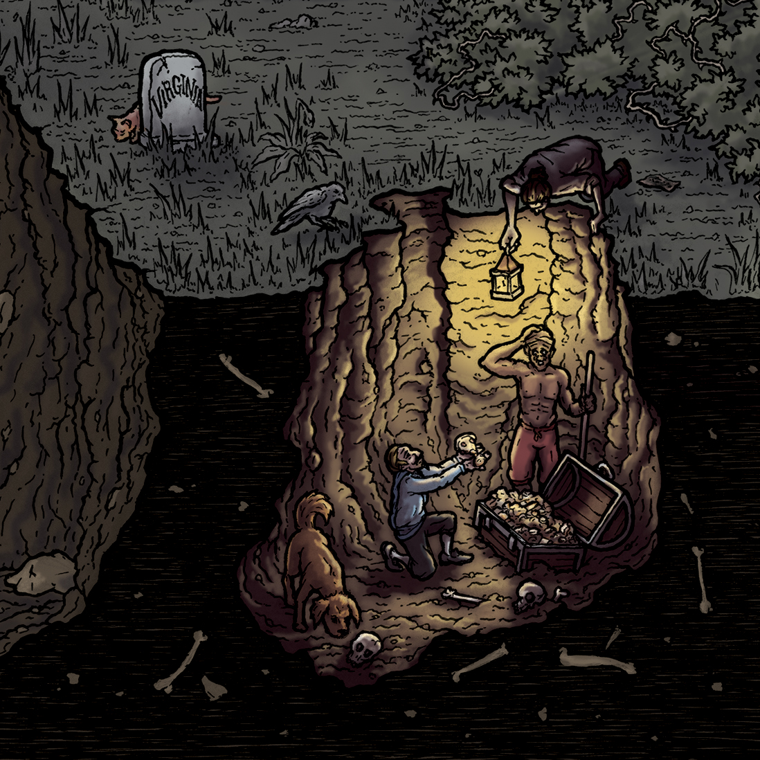
The final step was lighting. I wasn't terribly adventurous with the lighting on Murder Castle - it was my first attempt at anything like that - so I decided to try and make it more dramatic for Poe. As I was drawing the sketch, I made sure to include as many interesting light sources as possible to give myself plenty of opportunities to play. (I realized when I got down to The Cask of Amontillado that the only light sources were three torches mounted on the walls, nowhere near the action of the scene. I had to steal a lamp from another part of the house and add it in!) Here is the illustration fully colored before any lighting:
For each room, I had a 3-step process. First, I added shadows by applying a dark adjustment layer over the whole room, erasing it around each of the light sources, then adding it back to areas where the light wouldn't reach. I got better at this as I progressed through the drawing, which is why some rooms are lit better than others!
Next, I added a brightness layer because the shadows really dulled the whole thing and I wanted the rooms to pop! I also darkened the exterior to help add contrast.
Finally, I painted in light from each lamp, torch, and candle. I haven't done much - if any - proper light study outside of life drawing classes many years ago, so I just had to kinda wing it. I'll definitely put some time toward light study before tackling my next puzzle... I also added some sky details, brightened up the whole thing so the details can be seen, and my mother suggested smoke coming from the chimneys. Great idea, Mum!
After months of work, I finally completed the image on October 7th only to discover later that this was the anniversary of Edgar Allan Poe's death! Complete coincidence - I honestly had no idea - so I'm a little freaked out.
you can buy the puzzles and prints in the store
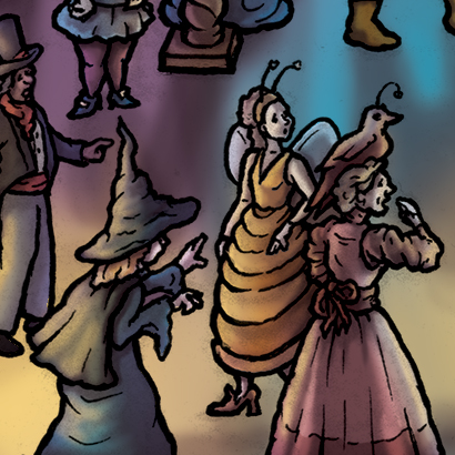
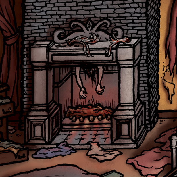
Here are some detail shots of the illustration. If you have any questions, feel free to post them in the comments. Thanks for reading!
SEEK-&-FIND ANSWERS:
